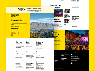
Copywork Day 2: Wellington City Council
Disclaimer: The design is recreated by me for UI practice.
Website: https://wellington.govt.nz/
Why I choose the design for practice:
1. Bold use of color 'sends out' the energy of a vibrant city through the interface.
2. Font pairing, the sans-serif font gives a modernistic look, while the serif font gives a welcoming and warm feeling.
3. Visual hierarchy of the blog section. Directing the eyes to the featured news by displaying the posts in different sizes, and the layout create an artsy look.
More by Zhiyang View profile
Like
