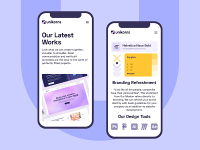
Unikorns Website - Mobile Screens
Hello Dribbble World!
Many Internet users increasingly prefer mobile devices. That is because they can easily and quickly search for information, read articles, and shop. The rise in demand made mobile the new norm and sites had to adapt.
As part of the work on the mobile version, it was important for Unikorns to create a convenient interface for our website for mobile users.
A white background adds clarity to the design and highlights important elements in the foreground. The typography is set up so that the text is readable and visually easy to understand. We left enough white space to create a clean layout and make the experience pleasant.
Moreover, we added enough large buttons for easy navigation to the next page.
Visually, the site looks more minimal on a mobile device, but this didn’t affect the functionality and aesthetics of the site.
Thanks for watching! Stay tuned for more shots 🚀
---
Follow us on Facebook / LinkedIn / Instagram
Also, visit our Magazine to read more about design, development, project management, and many more other topics!
Have a project? Let's talk: hello@unikorns.work
