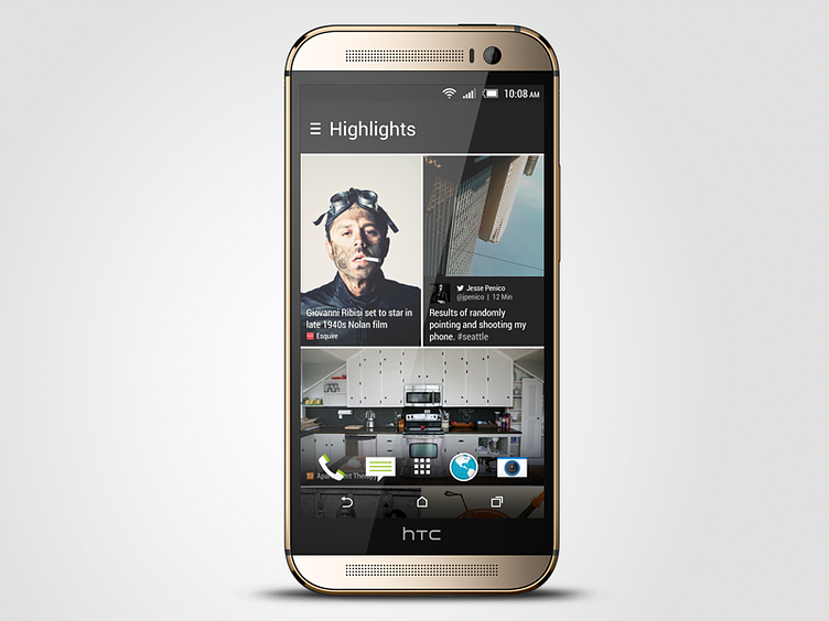
HTC BlinkFeed for Sense 6
Completely redesigned HTC BlinkFeed from the ground up for Sense 6. Really excited about this redesign, as I both learned a lot about leading (visual) design on a project, as well as creating a complicated system that improved upon an already well-designed product.
Some new design features: -Completely new system of tiles, allowing for more readable headlines, truer image aspect ratios, more dynamic range of sizes, generally cleaner look and feel -New grid (2-column instead of 3) -Updated font styles and sizes (text-only tiles now use a larger sized Roboto Light, while other tiles use a smaller Roboto Condensed) -Free-scrolling (instead of paging) -Color themes -Option to hide the weather clock and show a simplified "current category" header -Tappable links -Apps / Social Network avatars on tiles to more easily see who a post is from -And much more!
I will post more detailed examples soon. Hope you all have the opportunity to check BlinkFeed out in person sometime soon.
