Payment portal
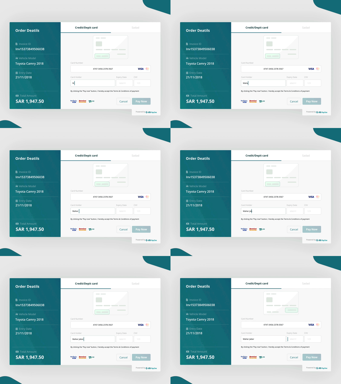
Often, users have a problem understanding what each field needs in a payment section. I have decided to add visual cues to inform users where each field information is located on a credit card. Since the user focuses on the field, movement is easily perceived through peripheral vision perception, so an animated card example would inform the user while keeping his focus on the task at hand.
Let me know what you think!
More by Reem B. View profile
Like
