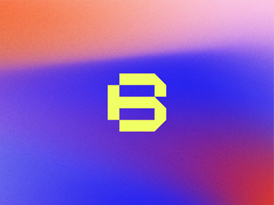
Blacktop Symbol
Blacktop, formerly Hail Studio, is a process-forward digital agency that exudes bold style while creating foundational work that is affective and representative for their clients. Blacktop was overdue for a new brand name and identity when new values and purpose were defined from a leadership transition years ago. We worked side by side with the creative team to uncover a brand identity that was unique, memorable, dynamic, and representative of themselves and the work that they do.
Blacktop’s new logo is built by bold, angular forms. This approach eludes to the drive of the agency—a symbol that stands for building, process, and the commitment to stay learning.
---
Have a branding project? If you think we can help you, get in touch hello@jaredgranger.com
