Volume Dark
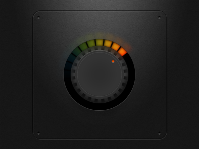
I think the darker version looks cooler but fails at two things:
1. Focus is drawn more toward the center of the knob more than I would like. Kinda boring there.
2. The dark interface means that beveling is more difficult in darker areas. More complex shapes require a lighter surface or look better with simple drop shadows.