Put a little bit of oil on the pan
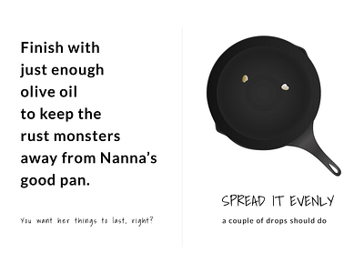
This is a mockup of a single fold zine format instruction page. Imagine it's one of several pages explaining how to care for a cast iron skillet.
I made this in Sketch using the fonts Shadows Into Light and Lato. I also created the pan and the oil droplets by using fill and border gradients and a bunch of different layers.
On #accessibility: I opted to prioritize usability over hardcore realism. I originally made the oil droplets a shiny black gradient, which looked like the real thing, but would have been impossible to see for a vision-challenged person. It also would rely heavily on the print quality to differentiate a dark grey droplet over a light grey gradient. This way, by representing the idea of oil droplets instead of illustrating a picture of the droplets 1:1, the image will even be usable if it's printed out on a low quality photocopier that doesn't do subtle gradients well.
