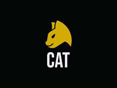
C - Cat
Hi Dribbblers!
This time I tried to make a logo that is not symmetrical. I wanted the logo to look natural and I think it's really cool. But at the same time, grids help me get shapes just right. I use them just to refine my execution so that everything looks tidy. What do you guys think? Happy to hear your thoughts on this logo and the overall look and feel of it.
Let's connect with me on Instagram and Behance
Or
Contact me at sandihidayat0204@gmail.com
Visit my LogoGround
More by Sandi Hidayat View profile
Like
