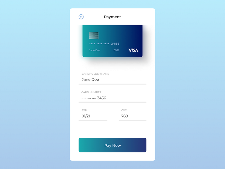
Credit Card Checkout - DailyUI 002
Here's my #dailyUI challenge 002 - credit card check out.
Going for something sleek, luxurious, and clean feeling. I like the idea of a payment page making everyone feel fancy and important.
Special thanks to @martinawolna for her figma template on credit cards, which I played with a bit to create my card.
Thoughts welcome! See y'all tomorrow. :)
More by Taylor McPherson View profile
Like
