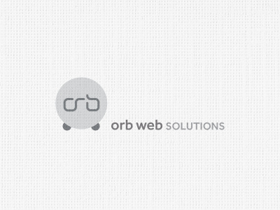
'Orb Web Solutions' Logo
A challenging name for a logo design. Just Google search 'orb logos' and you'll see what I mean. Has to be the most abused cliché.
But equally, there is no getting away that 'orb' is the company name.
This is one of a few ideas currently being presented to the client. The typemark is custom drawn, a free flowing form, clean, modern, fuss free. And hopefully not cliché in anyway.
The container is a clean icon styled affair, using muted metallic silver and navy blues to further remove our 'Orb' logo from the many horrific versions out there. But still retaining its grass routes. This is clearly a orb, but again, hopefully not too grim. I had added 'fun' little orb feet, so the orb stands free, thus creating a more flexible logomark in its own right, injects some character into, rather than just a plain sphere.
The x-height roughly same size as the 'orb feet'.
As usual, please feel free to comment, improvements, suggestions or just plain insults. Ta.
