Nomi

Nomi (derived from ‘to know me’) is an initiative of the foundation “Stichting KiKa”. It’s a web application that allows chronical sick children to get in touch with other children in the same condition. Sogeti supports this initiative by putting their available professionals at this project. When the professionals are in between jobs, they can make themselves useful by attending this project. I joined this project early 2019 in the role as an UX/UI Designer.
I didn’t join the project just to sit around and see how it would go. I joined this project because there was an urgent question pending. The design was outdated and there was no one left from the previous team to explain certain decisions that were made. So, when I started, I started along with a few others as a brand-new team. The goal was to redesign the product along with doing research to substructure it. The web application had to remain certain abilities such as the option to chat with other children. But when I started, I immediately noticed that the scope was way too big for the minimum viable product (MVP), because they wanted a chat functionality, effects within those chats, organizing and livestreaming events and online games. We decided to do some research to discover what the most important feature for children within this web application is and to focus on that.
It was the first time I had to redesign something that’s meant for children. I was aware that children have different needs when it comes to applications. But I wasn’t aware what those differences were. I had to do research on this topic before I could really get started with the redesign. I did my research by talking to children and reading guidelines specialized in designing for children. Along the way I learned that children want to have lots and lots of feedback along the way. For instance: when they pick a character as their profile picture, just let the words “great job!” pop up for a second. It provides them security and it lets them feel good. Another thing I discovered is that you have to let children scroll as little as possible. It’s better to have multiple pages to let them click through then have an endless scroll down. Children are easily distracted and certainly at long boring pages.
With the final font and colors, I started to redesign the web application. Remember when I said that it was far outside the scope for a MVP? That’s because there were so many features that the original goal was lost along the way. As a team we decided to stick with creating a good working ability to chat. After this was implemented properly, we would decide on which feature to implement next.
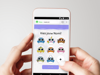
It took a few drafts before I was able to create something that was messy, but at the same time technically and hierarchically good. Every draft I made was discussed with another designer, but also with the development team where the developers were able to give feedback in what was possible and what wasn’t in the time we had. The communication was succinctly and therefore I was able to make quick fixes before we presented our newest ideas to the client. Because a lot of problems could be solved before this presentation took place, we could make a lot of steps in the time we had. In the images you can find a sight of the finished designs.