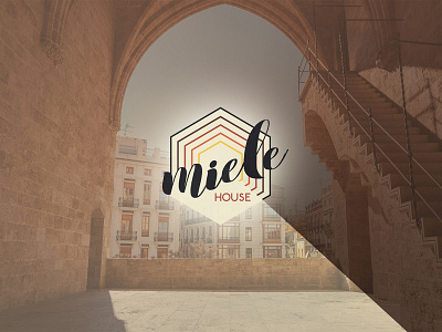
Miele HOUSE branding
The Miele House is a tourist apartment - a stylish loft in the heart of the historical centre of Valencia, Spain. The objective was to develop a memorable brand that would help a business stand out and secure a strong position in the highly competitive market.
We found inspiration in the names of the owners (Michele and Elena) and the main function of their business. This led us to create a visual system with clear and memorable communication. We combined the first few letters from both names and created "Miele". Miel in Spanish and Miele in Italian means honey" and perfectly conveys the feelings and emotions that Michele and Elena want their guests to experience - home comfort and sweet pleasure of relaxation.
The logo graphic conveys an invitation to enter the house. The main warm colour palette of deep red, orange, bright and sand yellows is complemented by neutral tones.
