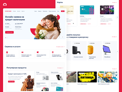
Home Bank | Website concept pt. 1/2
Hey, there 👋
At the end of December, I took a part in the internal "Home Credit Bank" design competition to update a bank's home page.
I believe that every project or small task should start with «why?». In our case the answer was simple. The current design looks outdated compared to our competitors and lacks value for current and potential users.
The next steps I made was mapping the goals for the redesign:
▪︎ The main goal was to keep all the bank's sections from the "production" home page, but give 'em a fresh look.
▪︎ The second goal was not to hurt the current user experience.
▪︎ The third goal was to add a place for marketing, educational, and informational materials, so the marketing and content teams could «speak» with users.
Result: The website has got a new, refreshed look, where all the goals were reflected.
