Upgrade to scale
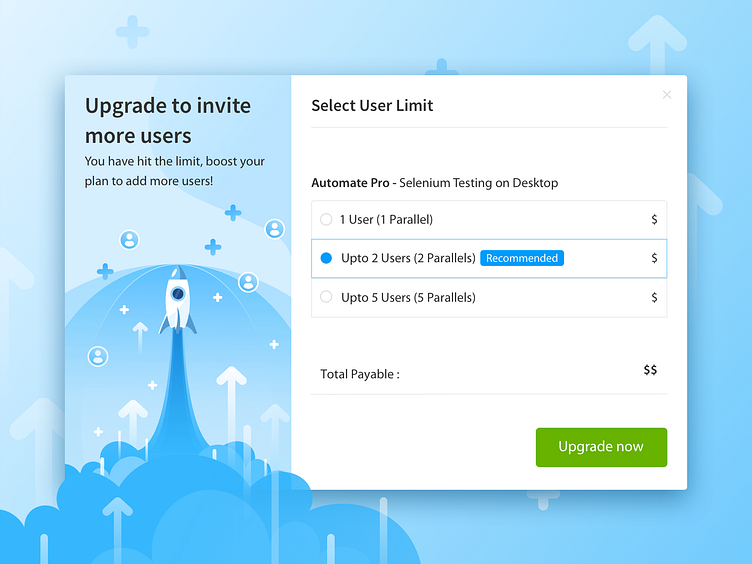
Small nudges make big differences! This upgrade screen was designed to help customers easily scale up to a higher plan when their current subscription would hit the limit.
The Rocketship is a pretty well-known metaphor and it seemed apt to use it to signify the emotion of scaling up, growth and speed. Small accents such as the ‘plus’ sign, the user icon and upwards arrows add to the visual communication. Gradients helped a great deal to make the whole visual look more dynamic.
If you enjoyed this shot, do give us a like! Follow Team BrowserStack for more updates.
More by BrowserStack View profile
Like
