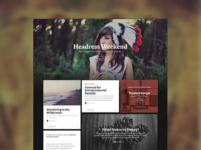
Medium Homepage Exploration
A design experiment with the Medium homepage aiming to make it visually richer and include types of content and social context. We decided against the direction for a number of reasons, but figured I'd share it here instead of letting it rot away in Dropbox archive :)
Note: Gray circles would be avatars of people you "know" that recommended a story :)
More by Medium View profile
Like

