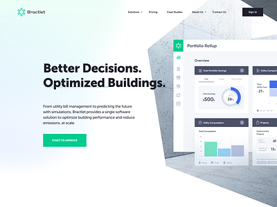
Bractlet Website - Approved Style
Hey, dudes!
Presenting the final exploration and approved style that I've been working on for Bractlet. Considering what Bractlet does, we were aiming to create a visual style that their users are expecting to see - which is those of a software company. Here you can see homepage header and some of the characteristic elements used throughout the website, as well as iconography and colors. Sharing more pages from this project real soon!
Bractlet predicts the future of building's utility consumption and overall portfolio savings by using super sophisticated simulation and bill utility management.
We teamed up with Bractlet team around 2 years ago when we helped them bring their Benchmark, Analysis and Simulation dashboards to life. Following success of the 3 product tiers, our team was given the go-ahead to present the company and its offerings through Bractlet's new website. The goal of of the website was to show building owners how they can get more out of their buildings, which we achieved by showcasing abilities of Bractlet product tiers and creating case studies supported by science and real data.
♥ Happy to hear your thoughts.
--
Let’s partner up!


