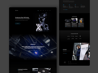
Continuous Composites - Home Page Design
Here's a look at the latest Continuous Composites home page design. The dark theme puts the website more on-brand with the ever-evolving design.
This project had tight constraints with a three-week window to design and develop the entire site. Check out the full site at:
More by Chris Whalen View profile
Like
