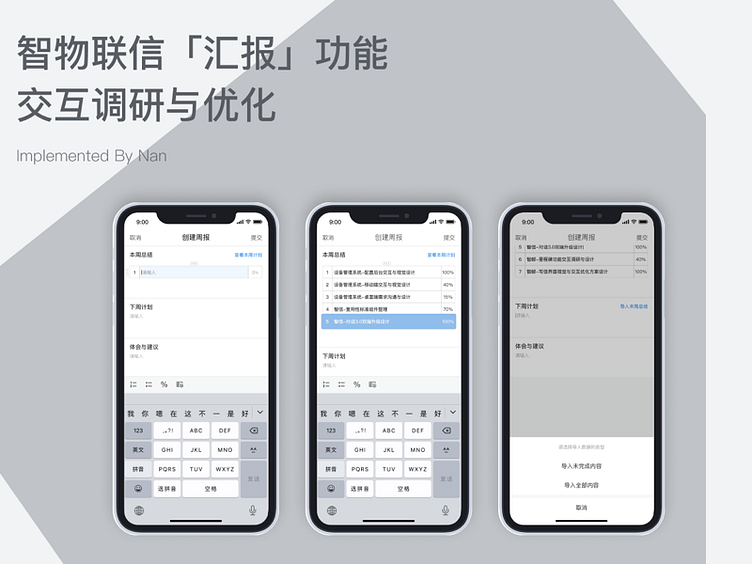
New design on a weekly report functionality
Some pain points were found out through user study (by user interview, behavior observation). Firstly, standing in point of management level, the format of reports was varying degrees. Some reports lacked concrete information to reflect working progress, while some didn’t organized within a clearly logic structure. Secondly, almost every employees complained about the “weekly report” template published by the firm which they have to fill in it first and copy-paste data to the weekly report app. As time goes, more employees edit directly in the app(as a result “format” turns into chaos). Additionally, some people reflected difficulty on switching keyboard from Chinese to Punctuation(for example to input %). Some people require an easy access to their original work plan in order to make comparison. Welcome to see more details on Behance: https://www.behance.net/gallery/109816295/UX-design-of-a-Weekly-Report-APP
Thx guys
