Roast Kings – Identity & Packaging Design


Delivering the highest level restaurant cooked meals to your door, Roast Kings aim to create beautiful dinners without leaving your home.
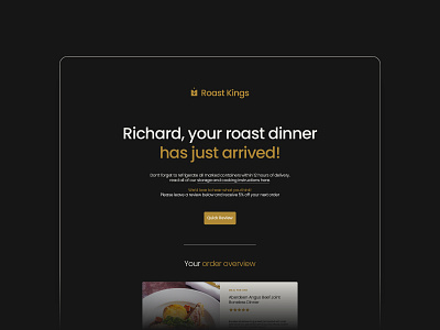
We worked together to create an identity that’s established and elegant, with a complimentary colour palette and pattern system too! The logo has been created using four quarter circles. The two on the left form an 'R' shape and the two on the right mirror this, forming a backwards 'K' shape – working together to create a formally balanced royal crown icon.
I've used small touches throughout for a more bespoke, personal and high end feel including a royal wax seal and calligraphy writing.
The client loved the end result with postage assets and packaging currently being printed for an early 2021 official launch!
