Breaking down the DWeb visual language
It is time to bring it all designs so far under the single board of visual language patterns:
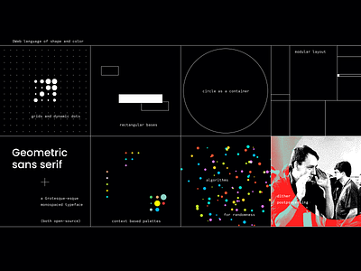
DWeb identity is based on grid because there is a beauty when some elements go off-the-grid.
The background is mostly black because it is a way we celebrate the legacy of coding. We use a monospaced typeface for the same reason.
The primary palette is black and white because it is the most accessible from any side you look at it.
The circle as a container… because it is the most beautiful shape! And I trust Sagmeister’s and Walsh’s opinion on this :)
Million of dots that are colored in million of colors is a metaphoric translation of “It takes millions to build a movement”.
Add modularity for efficiency and some dithering for a bit of “nerdiness” :)
Sounds like a wild mix? In reality, they’re all ticking in unison!