TopStack Resume - Homepage Exploration v4
I'm participating in a monthly challenge to redesign a homepage of TopStack - an online resume rewriting service.
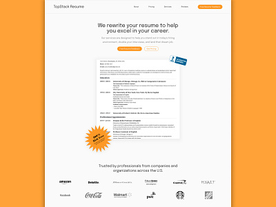
After getting some user feedback from the previous iteration, I concluded a few things:
Illustrations are risky when it comes to appealing all types of customers (I have to assume that TopStack provides services to all ages)
The BBB logos and the 100% risk free logos are essential for social proof! This is something I wasn't aware of as I'm not from the USA - I only realised this after some brief user feedback.
I'm changing my approach to remove these illustrations, include the logos somewhere within the hero section, and display a sample resume. If I get a chance to redesign the homepage, then I would some scroll down interactions so that the user can see the CV being changed in real time.
It's looking a lot more professional! :)
Let me know what you think about the layout!
---
Available for UI/UX design, website design and MVP prototyping.
Shoot me a message at jfs.urbano@gmail.com if you want to work on a project together!