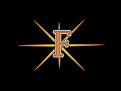
Frederick Keys Original Hat Logo Re-Design
This is my slight re-design of the Frederick Keys hat logo. The old logo was off center with the fireworks symbol in the background. The old logo's typeface was a little too sharp on the edges so I rounded off a simple serif typeface I felt fit better. It's not far off at all from the original, but I thought the original was a simple enough design that represented the team and city well.
More by Tuscawilla View profile
Like
