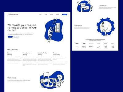
TopStack Resume - Homepage Exploration v3
I'm participating in a monthly challenge to redesign a homepage of TopStack - an online resume rewriting service.
This is my attempt in making the website more lively with illustrations. It definitely does make the website more interesting - however this probably only resonates with TopStack's millennial audience. There's a possibility that this type of new branding will put off some of TopStack's older customers. It's essential to have a design that fits the ideals of all types of customers, so I may need to abandon this idea.
I will probably need to contact TopStack's team for their key demographic, or do some user feedback/questionnaires on this.
On another note, I've rearranged the layout so that the user reads their services and how they work - I felt that was most important for the homepage.
I removed the Pricing section because I noticed it a trend to place any complicated pricing on a separate page.
I also added a new call to action - I thought having a free consultation would have enough incentive for first time users to partake in their services. The secondary call to action is to see the pricing plans.
Let me know what you think about the layout!
---
Available for UI/UX design, website design and MVP prototyping.
Shoot me a message at jfs.urbano@gmail.com if you want to work on a project together!
