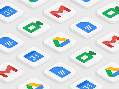
Daily UI 005 - App Icon
#DailyUI 005
Design an app icon.
The latest icon redesign for google's applications sparked a discussion on how similar the icon designs for gmail, calendar, google drive, docs, and google meet (and an array of others) were.
Taking the latest icon designs - flat icons with no shadows, rounded corners, and all 4 google colours on the app icon, I decided to redesign the icons based off the old design, but with the new elements incorporated by google. I did away with the google colours as it made the icons look far too similar.
In this case, a consistent look and feel (ie. fixed stroke thickness, curved edges, darker/lighter version of the same colour to give contrast) while keeping to a design that the users are familiar with would give google's suite of products its identity, rather than through the use of colours.
