iKana Nōto
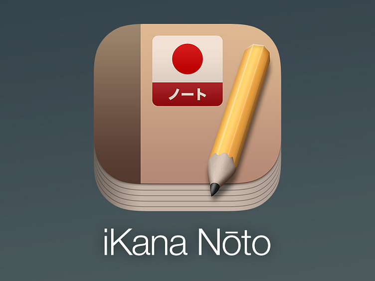
I'm in the process of reworking one of my apps to be flatter and less textured, part of the redesign is this new icon. I'm not a fan of iOS 7's minimal, garishly coloured icons so I try and strike a balance between looking fairly flat and simple while still retaining a bit of realism.