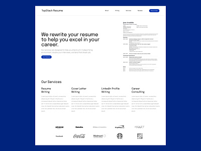
TopStack Resume - Homepage Exploration v2
I'm participating in a monthly challenge to redesign a homepage of TopStack - an online resume rewriting service.
I'm being very careful about my color and typography choices right now, as I'm not so comfortable with them yet. Nonetheless, the entire homepage layout is looking very clean!
I'm starting to think about TopStack's target customers. I assume they are looking for young professionals who are thinking about a career change but haven't gotten the experience or knowledge to craft the right resume.
In this case, it's important to brand themselves as trustworthy and easy to work with. I'm trying to accomplish that with a cleaner layout andeasy-to-read typography!
I tried to implement icons on the "Our Services" section but it was very difficult to differentiate "resume writing" and "cover letter writing" with just an image.
Let me know what you think about the layout!
---
Available for UI/UX design, website design and MVP prototyping.
Shoot me a message at jfs.urbano@gmail.com if you want to work on a project together!
