Page Layout

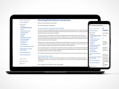
Sometimes websites aren't as simple, cut and dry as we would like them to be. This page was designed for a large college's website. There was a need for two separate navigation bars, the main header and a separate sidebar. Since the content couldn't disappear completely, this mobile pop up solution was created. The clean, simple colors, typography, and hierarchy make this page easy to navigate and understand.