Pro Court Systems (Brand Identity)
Pro Court Systems designs and builds outdoor and indoor athletic courts for sports and games like basketball, tennis, pickleball, and shuffleboard. The courts are created with square tiles that link together.
Pro Court Systems not only creates reliable top quality products but also focuses on bringing people together, self improvement, and making friends on the court.
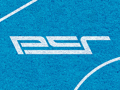
My main focus was to embody the values Pro Court Systems would want their customers to feel when they buy or see one of their products. Values such as Active, Passionate, Supportive, Fun, Reliable, and Quality. Through strong, bold, geometric lines we reflect reliability and quality. Through a mix of angular and curved lines we reflect activity, fun and movement. Through the overall solid structure we reflect supportiveness.
I took design elements from the court and applied them into the typography, creating each letter from the lines on the court. If you look closely maybe you can also notice the hidden Easter egg. The 'p' and the 'c' together make a court shape.
See the full project here: https://joeygreenwood.myportfolio.com/pro-court-systems-brand-identity
