Daily UI 009 - Music Player
Day 9 of daily UI.
The prompt: design a music player.
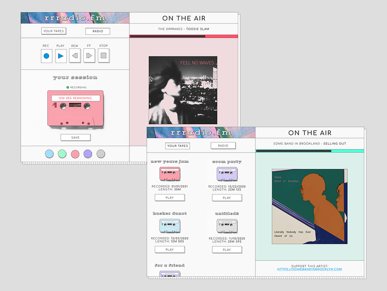
This is a unique music player meant for DIY artists. A lot of bands/musicians/other make cassettes, and get discovered for bookings on the youtube channels of "cassette collectors." (example https://youtube.com/c/HarakiriDiat)
I used asymmetrical/split screen design. I wanted the right side of the screen to really promote the artist. The left side of the screen is where the user would primarily spend their time.
There are two modes. I put these at the top since this is where a user would begin their experience.
1. Your tapes - where you would listen to your own mixtapes. 2. Radio - music would be played at random, just like you would with the radio.
The buttons beneath (record, play, etc) mirror a cassette player. It's a good metaphor for what the user would be doing.
There's a 3rd panel where the user could see how much time was left on their tape (30 min is usually the max for one side of a cassette tape) as well as notification that you are recording to the tape.
Finally a 4th panel for additional customization.
Buttons are all 3D with a "pushed in" active state. I think that potentially the functionality of the tape buttons would be confusing (do they allow you to rewind the tape or the song, for example) and on another iteration, I think additional UX copy would be helpful.
