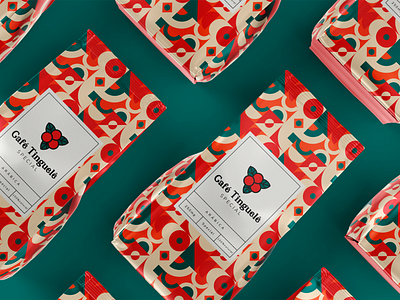
Visual Branding - Coffee Tinguelê
It is a company aimed at selling minimally processed coffee and recipes derived from the product.
⠀⠀⠀⠀⠀⠀⠀⠀⠀
The coffee comes directly from the farm, produced with great love, care and dedication by
traditional coffee producing families.
⠀⠀⠀⠀⠀⠀⠀⠀⠀
In Tinguelê coffee, our consumer stays on top of almost every process that happens with coffee until it reaches the shelf
⠀⠀⠀⠀⠀⠀⠀⠀⠀
Symbol construction
⠀⠀⠀⠀⠀⠀⠀⠀⠀
The main inspiration for the development of the symbol was the plant and its fruits. It represents in a simple and objective way all the attributes that make up the brand.
⠀⠀⠀⠀⠀⠀⠀⠀⠀
For the composition of the grid, a Mandala was used as the basis. This, in turn, also has other meanings, such as magic circle or concentration of energy, and universally the mandala is the symbol of integration and harmony.
⠀⠀⠀⠀⠀⠀⠀⠀⠀
The central circles that make up the symbol represent the whole union between the local culture and the product development process. The region is known as the land of coffee and music.
Link to the complete project:
https://www.carloshenriquedesigner.com.br/café-tinguelê
