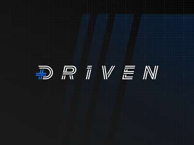
Driven Studios Wordmark Refresh
This year we worked with Driven Studios to refine their identity and come up with a clear visual direction for their brand. We started with their logo. We busted out our lettering skills to do some refining. To the untrained eye, it might not look night and day different. But if you know, you know. Swipe through the slides and we’ll take you through exactly what we did. Hopefully, you’ll find it as satisfying as those “Detailing the filthiest car” videos.
More by Untitled Era View profile
Like


