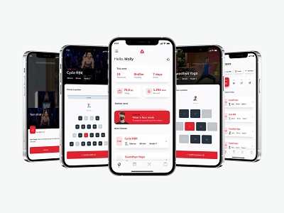
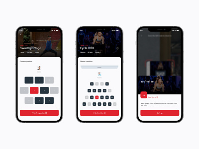
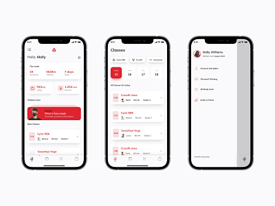
Reebok App Light Version
So I decided to work on the light version of the last post. For my surprise, I think the dark looks nicer, even tho I don't use dark mode. Anyway, was a good opportunity to work with 2 color pallets for the same components.
More by Matheus View profile
Like


