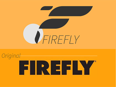
5 Hours Logo Challenge #3 - Firefly
Firefly Logo Re-Design and brand concept .
I am really proud of this project. I gave it a mark that both resembles a letter "F" and an actual firefly. To me it's simple, but industrial. The last two post we're very organic marks so I wanted to create more of a geometric logo. In fact, I think I will start on creating Geometric Logos starting today, because Geometric logos are modern, sleek, serious and simple. I gotta admit the packaging label isn't tight, but maybe next time if I have more time.
More by Mc. John Zabala View profile
Like
