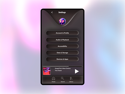
Daily UI 007 - Settings Page
This is my first attempt ever at neomorphism. Not as sleek as I'd like. Something about it feels very late 00's PC gaming. If you're reading this, I'd love some feedback. There really aren't very good tutorials out there for doing this in Figma.
If I figure it out myself, I'll write one!
Day 7 of daily UI. The prompt: design a settings page.
This is based on Spotify's settings page.
The problem: It's very easy to get lost and find your way back. I think over the years as Spotify has introduced new ways of customizing your experience.
e.g. Should I go to "Audio Quality", "Playback" or "Data Saver" if I want to make my music lower fidelity when streaming?
The solution: Card sorting for new information architecture.
One thing that helps is if you can start very broad, this will help give users clues along the way. There were 15 categories to choose from in settings- some of which had several more categories to click into, some with only one setting to turn on/off.
I nested these in 5 categories- which I thought created broader context to help the user understand exactly what settings they were clicking into.
If I had unlimited time, I would really have loved to done a cardsorting session with more people. And of course design additional screens!
