Running App


The team is available for new projects! Drop us a line: hello@purrweb.com | WhatsApp | Website
What’s up guys? Check out our recent attempt to design an app for runners 👋
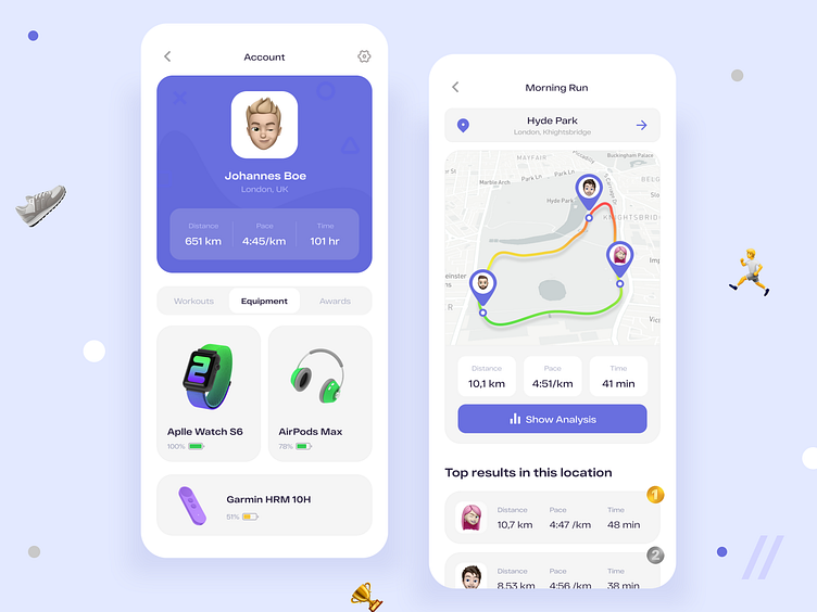
🏃♀️ The left screen shows the user’s account — profile picture, name and city of residence. There’s also information about workouts: the distance the user has run, the average pace and the time spent while running. Plus, you can see the devices connected to the app and their battery levels.
🗺 The right screen is the workout screen. It shows the location where the user runs and map with the route. On the map you can see other users that ran this route, the colors indicate their speed and pace (red is for slow, yellow is for normal, green is fast). The users can tap the button ‘Show Analysis’ to see detailed information. Below you can see top results in this location.
🦋 We chose blue as the accent color — it’s pretty common and creates a nice contrast with the light background.
🏃♂️ With this app users can compete with each other, add devices that help them with the workout and see detailed analysis.
Press L if you like our design and share feedback!
Created by Valerian Boyko
PS We know to utilize UI/UX design to make users fall in love with a product. Check out how we used our skills to: - raise $400k as capital for startup - streamline cryptocurrency e-wallet - reboot a Real Estate startup - help newbies jump into investing - conquer the chef freelance market - simplify the life of event organizers And that's not all — you can find more case studies in our Blog! 💜
The team is available for new projects! Drop us a line: hello@purrweb.com | WhatsApp | Website
What’s up guys? Check out our recent attempt to design an app for runners 👋
🏃♀️ The left screen shows the user’s account — profile picture, name and city of residence. There’s also information about workouts: the distance the user has run, the average pace and the time spent while running. Plus, you can see the devices connected to the app and their battery levels.
🗺 The right screen is the workout screen. It shows the location where the user runs and map with the route. On the map you can see other users that ran this route, the colors indicate their speed and pace (red is for slow, yellow is for normal, green is fast). The users can tap the button ‘Show Analysis’ to see detailed information. Below you can see top results in this location.
🦋 We chose blue as the accent color — it’s pretty common and creates a nice contrast with the light background.
🏃♂️ With this app users can compete with each other, add devices that help them with the workout and see detailed analysis.
Press L if you like our design and share feedback!
Created by Valerian Boyko
PS We know to utilize UI/UX design to make users fall in love with a product. Check out how we used our skills to: - raise $400k as capital for startup - streamline cryptocurrency e-wallet - reboot a Real Estate startup - help newbies jump into investing - conquer the chef freelance market - simplify the life of event organizers And that's not all — you can find more case studies in our Blog! 💜