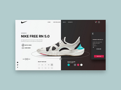
Nike Light and Dark Mode
This UI redesign takes Nike to another level by showing how a user could experience a redesigned product page using an interactive shoe customizer with both light and dark mode. A user can spin the shoe 360 degrees, and change the color and size and watch the shoe transform before their eyes. The right hand add to cart menu appears when a user taps the hamburger menu which natively floats on the right with a slight shadow underneath it, or by clicking the "Add to Cart" button which floats on the right when the add to cart menu is hidden.
Checkout my page to see more shots along with the full version of both versions!
If you like my work, or want a follow back, follow me or checkout my web design portfolio at https://connorschmitt.com/ and my UX portfolio at https://connor-schmitt.webflow.io/
Inspiration: Ilia Utkin
