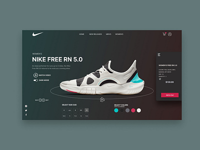
Nike Dark Mode
This UI redesign takes Nike to another level by showing how a user could experience a redesigned product page using an interactive shoe customizer with both light and dark mode. A user can spin the shoe 360 degrees, and change the color and size and watch the shoe transform before their eyes. The right hand add to cart menu appears when a user taps the hamburger menu which natively floats on the right with a slight shadow underneath it, or by clicking the "Add to Cart" button which floats on the right when the add to cart menu is hidden.
I also redesigned a light mode piece, checkout my page to see that shot along with a comparison image!
If you like my work, or want a follow back, follow me or checkout my web design portfolio at https://connorschmitt.com/ and my UX portfolio at https://connor-schmitt.webflow.io/
Inspiration: Ilia Utkin
