O-KU
Serving up sophisticated Japanese sushi dishes with a Southern twist has made O-Ku a beloved sushi staple across the six southeastern cities they reside in. Though they all share the same name and concept, each location has unique menu variations as a result of each chef's culinary creativity and local seasonality.
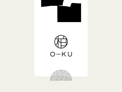
The group wanted a branded identity that would allow the individuality of each location to shine through, while still being represented as a unified vision, with standards that could be expected and gold-star experiences that could be relied upon. A modernized logo stays focused on the Japanese symbol of a 100-year old oak tree, a notion of longevity, tradition, and honor.
