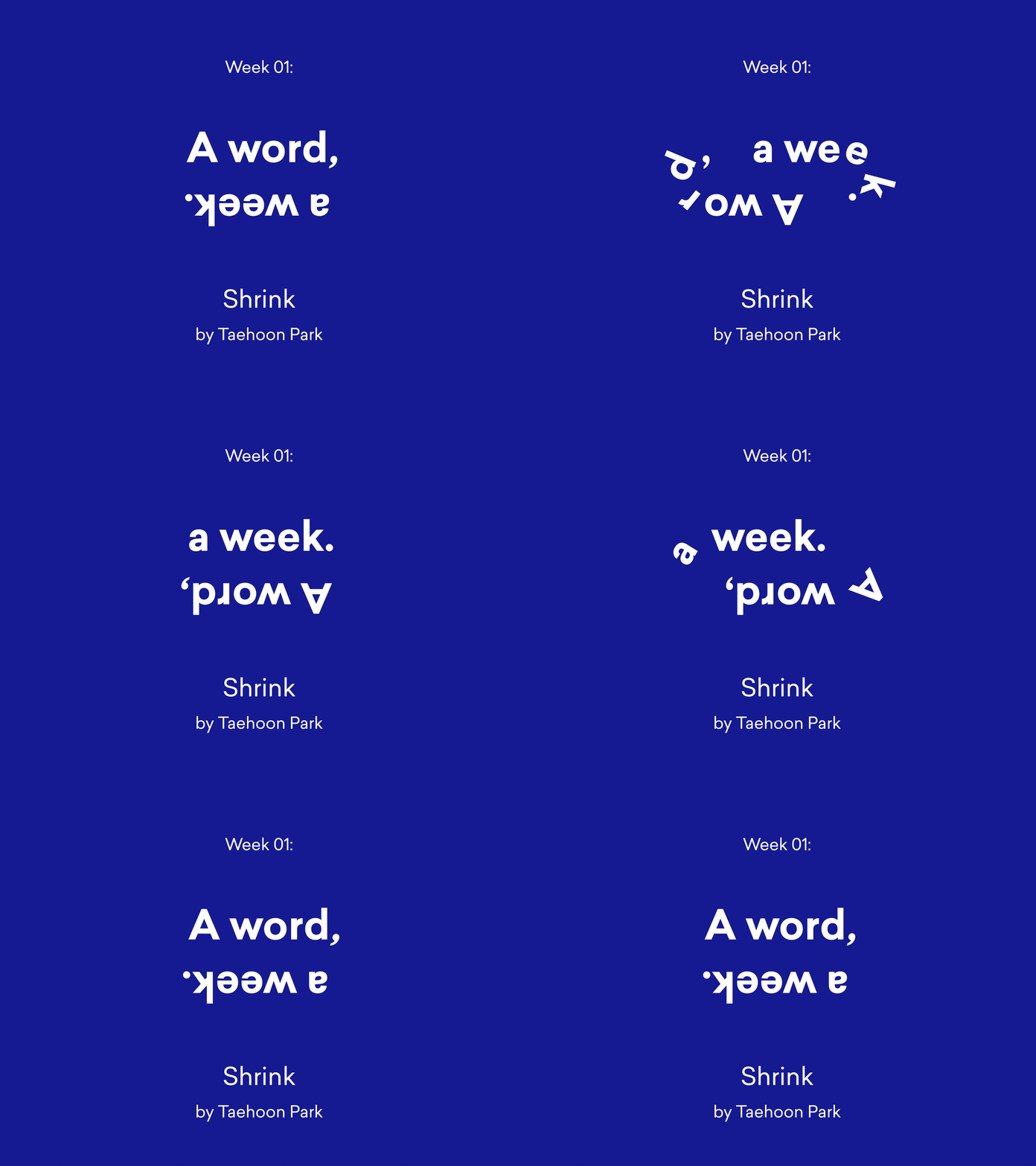
A word, a week. – 01 – Shrink
Kicking off a new year of ‘A word, a week.’ with this amazing 3D piece by the talented Taehoon Park (http://taehoonpark.tv) from South Korea. A very worthy opener of the 2021 edition! Check back in next week for № 02 by ThisThingOfOurs.
‘A word, a week.’ is an ongoing collaboration to see our animated typefaces in the hands artists we admire. A typeface is never a thing on its own. It’s always meant to be part of something bigger. Each week we release a new animation by a new artist. It features a single word, set in an animated typeface from our collection. The artist comes up with the word and gets complete creative freedom. We get to see our type in action, and share the inspiring work with you.
Typeface in use: Barbour Try or buy this typeface yourself at: https://animography.net/products/barbour
Design & animation Taehoon Park
Sound design White Noise Lab
Type Design Timo Kuilder
Type Animation Philip Von Borries
Pssst! Taehoon has a course on rendering in C4D. Check it out at https://coloso.co.kr/mediadesign/motiongraphic_parktaehoon
Or learn to create your own animated typefaces with our own course at https://motiondesign.school/products/animated-typefaces-with-animography


