Cafe logo design
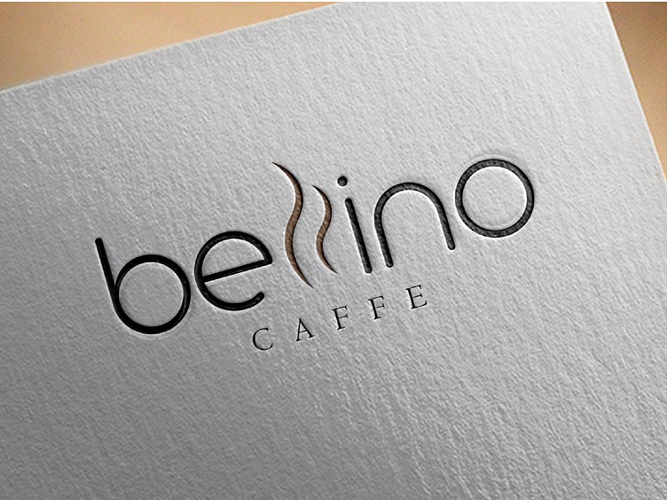
Logo design for a cafe called Belino. The request was to make a logo of simple and modern design that will visually describe the activity of this company. This is achieved in this case by the design of the logo "Belino" which is shown through a font from the group of modern serif fonts and as such is appropriate and suitable for showing this activity whose target group are young people, while the word "CAFFE" is written in elegant modern serif font, which together with "Bellino" creates a positive contrast and harmony and adds to the logo the properties of stability, firmness, elegance. In addition to the desired features, I would like to present the industry for which the logo is intended, Namely, this shape of the letter L achieves the association of smoke from coffee, ie hot beverage in general, without disturbing the legibility of the name, which remained clear, and in this very simple but clear way the association with the cafe was achieved as the activity of the company for which the logo is intended. . With this combination of fonts, colors and elements, the logo leaves the impression of a modern, exclusive, modern, innovative, stable and elegant cafe, great for relaxing and socializing with coffee or some other beverage.
If you like my works and need some design or illustration, for more information write to me on DM on Instagram and follow me there as support, the link is in the description :). Thank you!
