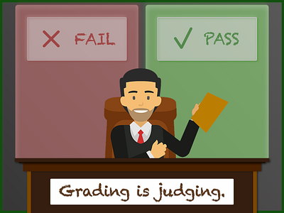
Grading is Judging
I built this image in Sketch.
First I created the desk and background cards, then adjusted the background cards to have equal visual weight. That meant adjusting the shadow opacities and blur amount, and the overall opacity of the cards themselves.
Then I added the white background to the title text so that the eye would be drawn there second (people look at people first, then text)
Then I downloaded a PNG of the man, his chair, and his paper from pngtree.com and dropped him in behind the desk.
More by Max Blum View profile
Like
