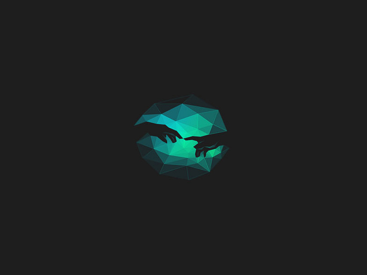
IDZN logo
Always hard to translate somewhat 'creation' as a symbol, It turns more difficult when you need some logo usage specifications, negative space, etc.
I tried here to make some kind of depth using the triangles transparency, specially on hands details, I hope it is instantly recognizable. The reduced size here is intentional.
Feedback is very appreciated :)
More by Breno Bitencourt View profile
Services by Breno Bitencourt
Like
