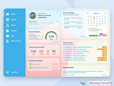
Binusmaya Student Dashboard
Hi Guys! Hope you're all doing well.
I try to redesign my university (BINUS University) student portal using a more modern look with pastel color and glassmorphism UI. The main idea is to simplify the navigation and rearrange the content based on what we (students) access the most.
For this redesign, I'm collaborating with Donny Devanda. You can see the Course page design here.
Glassmorphism UI is a visual style to visualize a frosted glass look. This can be done by using blur and transparency effect in your object.
Press "L" to show some love!
More by Johannes Farrell View profile
Like
