Apple Cash View Redesign

If you're an iOS user and have an Apple Card, you're probably familiar with Daily Cash. While browsing the Wallet App, I noticed a few design opportunities.
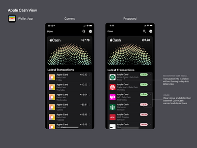
1. It's difficult to recall which purchases yielded each Daily Cash amount listed (unless you tap into detail view).
2. It could be easier to distinguish between Daily Cash earned and deductions.
I decided to address these issues by making some small adjustments to the "Latest Transactions" view. In my proposed redesign, color is used to provide a clear distinction between Daily Cash earned and deductions. Also, the addition of transaction info provides key details upfront.
These adjustments are minor but they show that small details make a difference.
What else would you change?