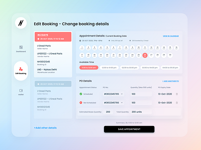
Edit Booking
The idea is to create modern, simplistic, user-friendly look.
To ensure that I researched websites offering warehouse management systems.
While creating illustrations I approached it in a way it would create familiar feeling for users(sellers).
To ensure focused and simple user experience I tried to keep enough breathing space by using negative space and transeprancy along with minimal shadows.
Design is centered around the content to enable ease in decison-making.
More by Xcarbon View profile
Like


