Social Voting App
Hi, friends!
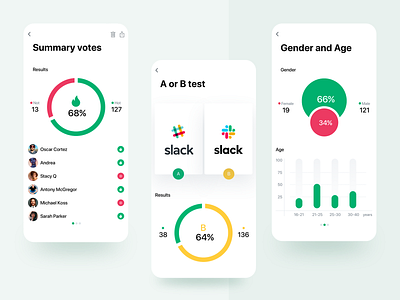
Take a look at our new design for a voting app that helps businesses test their ideas before investing in them.
For the app, we chose simple design elements that we all use in popular social networks, like 👍 and 👎. This way, we ensured the interaction of users with the app is intuitive.
To help businesses easily understand the results of voting campaigns, we decided to use only two main colors on each screen.
There are a lot of other tricks we used in the design of this app to tailor it for both types of users ‒ entrepreneurs who need to validate their ideas and voters.
Find out more about the design solutions we came up with from our case study https://ugem.design/projects/case-vootex
Let us know your thoughts in the comment. 🙌
More by UGEM View profile
Like
