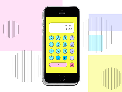
Daily UI 004 - Calculator
Day 4 of daily UI. The prompt: design a calculator.
I thought about numbering 1-9 instead of 9-1. I think breaking this rule would actually be justified with some testing! The traditional calculator design was a necessary choice based on mechanical calculators.
Interesting read here: https://twitter.com/kelecash/status/1341059815863410688?s=20
Look, I'm not going to improve on the calculator!
I made a really simple calculator that would have the potential for fun micro-interactions (such as a button push) which maybe couldn't serve as an app by itself, but could be a part of a bigger project.
The buttons themselves are meant to be an accessible size for fingers- so no misclicks for phone users!
Color choice:
Light Blue - Main component, the numbers.
Bright Blue - Decimals and percentages are a part of defining a variable, which is why they're still blue.
Purple - Operators, sans '='
Pink - I wanted the equal sign to stand out the most apart from the other operators.
Red - Delete! The most important button, in my opinion. Calculators that require you to clear all are so frustrating for those of us with clumsy fingers.
