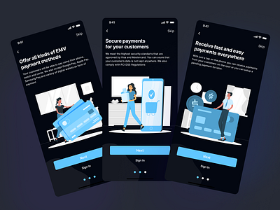
Outpay - Onboarding Screens - Dark Mode
Hey guys!👋
💸 Check out this concept project for a Mobile POS App that allows small businesses to receive mobile payments and transfer funds to their bank account fast, easy, and secure!
📱 In this shot, you can see the onboarding flow for the application. The flow lets the user know what are the biggest benefits of using the app. The users also have an option to skip directly to the last screen where they can either sign in or create a new account.
🧪 I decided to include illustrations to portray a modern, friendly, and professional look while also looking reliable. On each screen, I used several shades of the primary blue color to build a hierarchy of importance.
Expect more shots from this project soon!
Meanwhile, I would love to receive your feedback so It can help me improve and grow✌️
