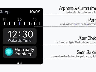
Sleep Tracking App - Main Screen Anatomy 🔎
The author has been creating this project for 4 months, redrawing and rethinking the design 4 times from scratch.
Following the news about Apple's sleep tracking app, I started to create my own concept that would reflect the vision of the app. While working on the design, I studied an abundance of scientific articles, given below. Information on the factors that affect sleep is provided from the sources: Sleep Research Society, Oxford Academic, SleepFoundation.org, and others. I wrote scripts in JavaScript to create realistic heart rate data and sleep stages. The "Sleep Tracking App" project is an indicator of the author's principles and approaches. Begin.
In the center of the main screen of the application is an alarm clock that displays the next time the user wakes up. Above it flaunts a "ruler" - a time scale on which the nearest minutes are marked concerning a user-defined smart alarm interval. The default interval is 30 minutes, i.e. the watch with the help of sensors will wake up a person at the optimal time for waking up with a margin of ± 15 minutes. For example, if the alarm is set at 12:30, it will ring at the optimal time from 12:15 to 12:45. To determine which mode is set, look at the roulette wheel. If one number is highlighted (for example, 30), then the "normal" alarm clock mode is set, if highlighted (for example, 15 and 45), and 30 remains in the shadow, the smart alarm clock mode is preparing to work wonders.
Project on Behance:
https://www.behance.net/gallery/109865487/Sleep-Tracking-App
