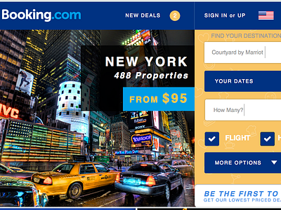
Bookingdotcom Revised
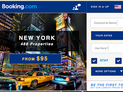

Cleaned up the design elements. I had wayyyyy too much going on with all the colors everywhere and no visual hierarchy. With the yellow as a slight accent, it simplified most of the elements. I centered the blocks of info on top of the pictures, which I'm still not sure if I like... There was a "help" element on the left-hand side that would scroll with the user, but I decided to add that in the navigation to clarify it's purpose a bit.